Our Money in Data
An Empirical Look at the Average American’s Finances
It is not from the benevolence of the butcher, the brewer, or the baker, that we expect our dinner, but from their regard to their own interest. We address ourselves, not to their humanity but to their self-love, and never talk to them of our own necessities but of their advantages.
-Adam Smith, The Wealth of Nations
Currency is a medium of exchange.
Nothing more, nothing less. It enables the exchange of goods and services in a denomination other than chickens, beef, flour; or something else you would have to barter with if you did not have these silly coins.
Those weird—nay arbitrary—set of units provide the world with efficiency.
It is a rather under-appreciated thing how little we have to care about not having to pay for a chicken sandwich1 by fixing my butcher’s computer, car, or whatever.
These arbitrary units play an extremely important role in our society and are more than an elegant mechanism for driving efficiency, they are the implicit oxygen enabling the breath of progress.
The elegance of these silly tokens is rooted in the profound yet simple exchange of labor for capital.
But not everyone has these coins and the accumulation of them is a nontrivial aspect of our economically bifurcated society.
These facts lead to at least two important questions:
How do we get these coins?
What do we do if we don’t have enough of them?
I will do my best to answer them with data.
As a brief note, I will be explicit about when I condition data and mention where I do so, otherwise I will not. Filters that you apply to data dramatically change the conclusions you make from them and I aim to provide not a perfectly contextualized story of the labor force but instead one about money in America.
How do people make money?
Wealth is the accumulation of positive cash flows generated from income.
Typically that income is generated through working and earning wages, sometimes through investments, sometimes through inheritance or gifts, and sometimes through government subsidies.
That last one is often forgotten but a substantial share of Americans do not have a large savings to pull from nor do they have a FICO score greater than 750 (but more on that later).
Wages
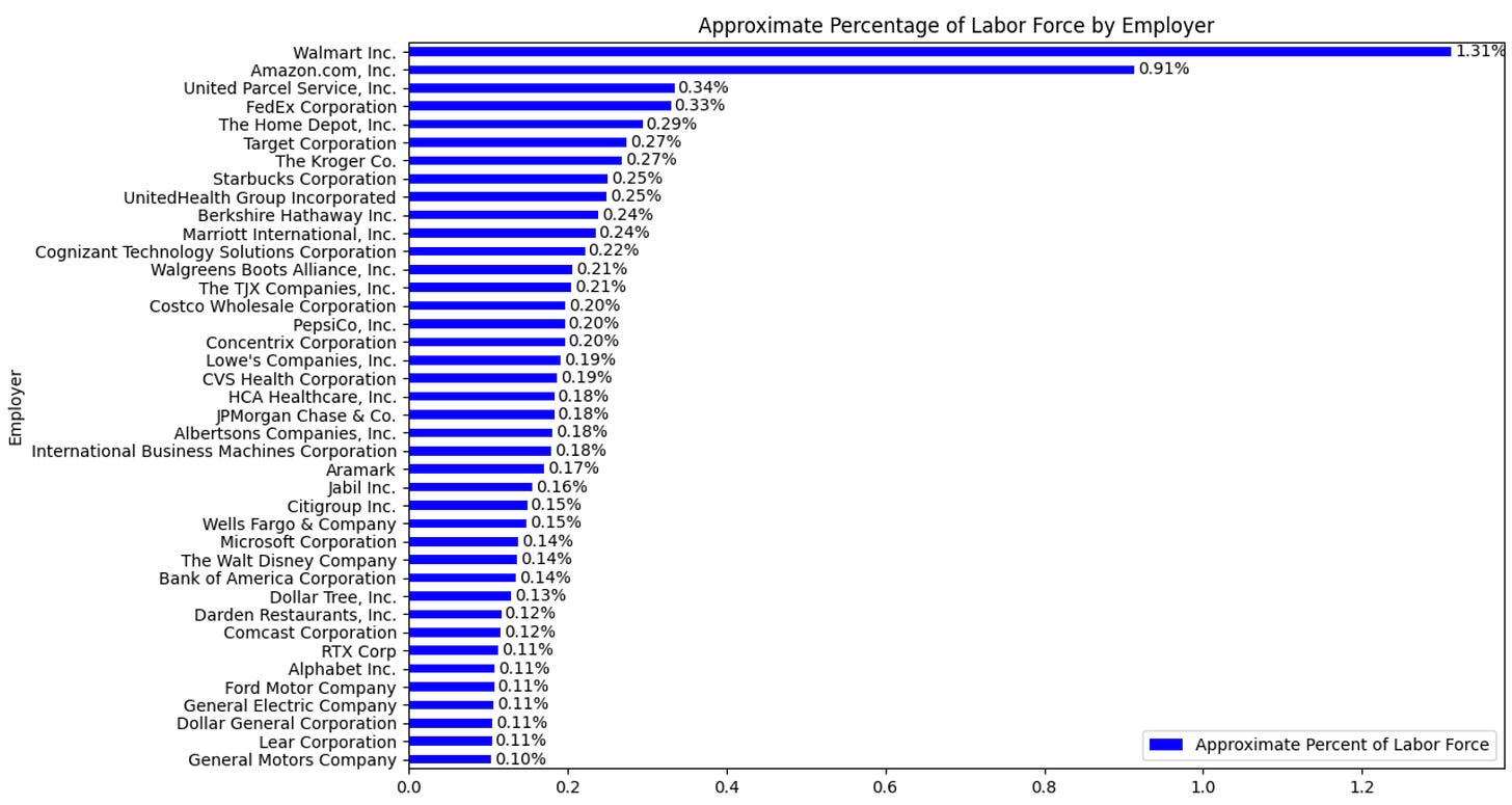
Approximately 85% of employed people work for the private sector and the remaining 15% work for the public sector (i.e., federal, state, and local government).
The government is the single largest employer in the US.
Walmart is the largest private sector employer with 2.1 million people employed by them; Amazon trails behind; and the rest of the major employers are much smaller.

Knowing where people work is helpful but it doesn’t tell you how much they make, unfortunately we don’t quite have that level of data publicly available.
But we do have IPUMS—i.e., the Census.
From the Census we know the median annual personal income in the US was $40,080 and the median household income was $74,580 in 2022.
And while the median income of both households and individuals is informative, it certainly doesn’t give us the whole picture.
Fortunately, the Census data is open to the public and we can explore the data together.

In the graph above I plotted a smoothed histogram of the Total Income reported in the Annual Social and Economic Supplement (ASEC) issued by the Current Population Survey (CPS).
It is a relatively well known empirical fact that higher education tends to lead to higher income and we see that in the graph above. Of course, as you can see there is significant variation and while that empirical fact is true on average it certainly is not true for everyone. Looking at the entire distribution2 gives much richer context about that.
I will likely do another article diving deeper about income by various dimensions. I chose to display income by education here because it is (1) a quite well known and studied average phenomena and (2) I have struggled to find a proper visualization of the distribution of income by educational attainment.
Beyond Wages
We can do more.
The ASEC data allows us to dig into income sources further and breakdown what makes up a person’s total annual income (shown in the graph below). As you would expect, most people’s annual income is from some form of earned income—approximately 67% (wages, business income, etc.). The next largest category is from government sources at 23% and the third is investments at ~9%3.

Investments
The average investment income by educational outcome tells a rather dramatic story, especially when you make a modest assumption that the investment income is 10% of the actual capital required to generate that income (this is obviously wrong but likely understates the total capital).
In short, you will find that educational attainment maps dramatically to investment income. On average, those with less than a high school diploma effectively have no investment income (notice the concentration of the red density function around 0) and those with a graduate degree have an average of ~$7,200.

Some people earn a meaningful share of their income from investments alone. This is money at work but only represents a small share of Americans.
Inheritance
The median inheritance in the US was ~$12,353 according to the Survey of Consumer Finances but that is not uniform across income percentiles. UPenn provided a great set of data and I have graphed it below.

As you can see, high income earners have high income earning parents who leave them a meaningful inheritance but 90% of Americans get ~$13,000 or less. Of course, a one-off capital injection of ~$13,000 is very meaningful to an average income earner of $40,080.
Government Benefits
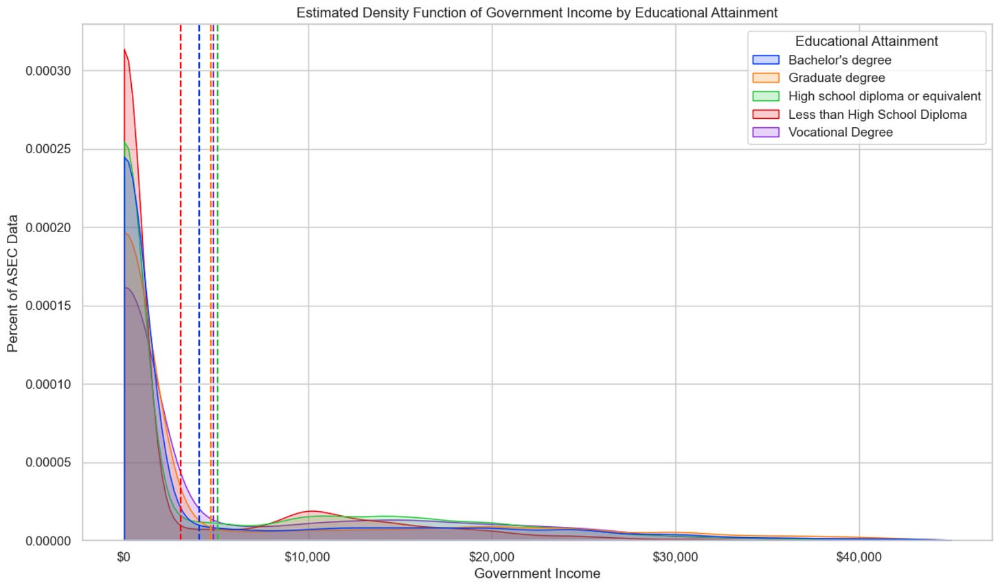
It turns out that ~25% of Americans have some form of Government provided income and it constitutes an average ~65% of their total income for those that actually do have Government income.
The variation by educational outcome further highlights differences in economic outcomes, where Bachelor’s and Graduate degree holders have a nearly ten percentage point difference in Government income relative to those with a High school diploma. Those with less than a high school diploma have the lowest Government income and this result could warrant a further deep dive in its own right.

Government, Investment, and Wage Income
Averages hide variation, so I attempted to provide a single graph that aimed to show as much as possible in as few lines. The chart below takes a bit of time to digest but it is worth reviewing. It shows a more holistic picture of the income sources of America. I should note that because the Census does not offer inheritance information, I cannot plot it here.

The conclusion is simple: most people make their income from working, second from the government, and some from investments.
How terribly obvious.
But now that obvious statement is grounded in data and a little more rigor.
How do people manage liquidity constraints?
They borrow money.
As previously shown, 46% of Americans do not have any investment income, which means they likely don’t have a stockpile of capital they can trivially access if they have a large emergency expense. That means that nearly half of Americans are liquidity constrained—i.e., they have low liquid assets relative to disposable income or recurring expenses. We can infer that if people have no investment income then it likely means they have limited savings or disposable income, which would correlate well for a liquidity constraint.
To properly estimate the magnitude of how many Americans encounter a liquidity constraint, we would need both banking data (e.g., cash account balances and other assets more generally) as well credit data (e.g., loan types and sizes). Unfortunately, the Census data does not provide either and other alternatives, like the Federal Reserve do not give a particularly useful picture either (this is me explicitly saying headlines like “Credit card debt reaches all time high” are stupid).
Fortunately, Experian published a report on the state of Consumer Credit in Q2 2023.
And the key data points are:
The average non-mortgage debt balance was $23,317 in 2023
The average non-mortgage debt balance increased by 4.7% from 2022 to 2023
The percent of accounts 30 days or more past due increased 0.36 percentage points
The average monthly payment required to service debt increased by 8.5% to $1,148
Overall, from the single lens of FICO, the consumer appears to be credit-wise healthy. That may not map to financially healthy overall but it is certainly something we can look at.
FICO Score
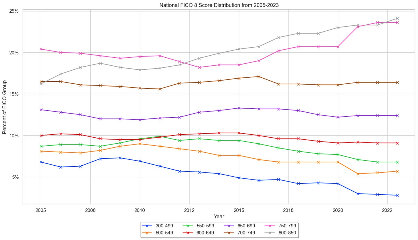
So what does the FICO distribution tell us?
Number go up. Yay. 🙃

This distribution would have you think that 53% of people with a FICO score have FICO < 750 but this omits the ~19% (49 million) of people in the US who do not have a score. In practice, these consumers are declined from applications of credit because there is insufficient credit history/data which is only marginally different than treating4 them as having a score of zero which means nearly 63% of people in the US actually have FICO < 750.
The conclusion here is also simple: most people don’t have perfect credit and a lot of people don’t have what’s considered “good” credit.
It is worth stating this because your credit score impacts how much you can borrow and the price at which you can borrow, which obviously drives your ability to manage a liquidity crisis.
In Summary
Most Americans don’t have big piles of cash stocked up and large amounts of credit they can access in case something happens.
So what can Fintech companies do? 🤔
Build financial products that help your customers.
Finance reduces to the borrowing, spending, saving, and investing of money. Fintech is about using technology to efficiently do those things.
So, for any single Fintech company that means executing efficiently at high scale so that you can (1) be more cost effective than your competitors, (2) improve your profit margins, and (3) pass on some share of your cost savings to your customers.
Times are challenging. The past year has been turbulent and there is more turbulence on the horizon, so please go and work your butt off so you can help our fellow Americans5.
I have provided you with sufficient data to show you that people need our help, so we must rise to the challenge—isn’t that the whole point of Fintech?
There is ample business opportunity in providing value to customers of financial products. But if benevolence does not compel you enough, consider the massive economic opportunity that exists.
Not long ago both public and private markets understood how massive that opportunity was…and then the reckoning came. It appears that the pendulum has swung probably too far in the other direction. Remember, be greedy when others are fearful.
Closing Thoughts
It took me roughly six months to write this article6. Largely because I spent so much time pulling and cleaning data and making revisions. I also created my first open source Python library (PyIPUMS) to work with the data, which was one of the goals I had this year and I’m happy to now mark it as completed.
The code and GitHub repository is available here. You can also find a much more elaborate set of graphs in the Jupyter Notebook used for the analysis here.
I first worked with IPUMs in 2011 (👴🏻) during my first master’s. Back then I was coding in STATA and I had mostly no idea how to work with data. I decided to write this package to help graduate students in Economics or Statistics that may not be as familiar with Python, how to work with XML, and with data in fixed width format—as it can be quite terrifying for the uninitiated. Hopefully it saves them some time and helps them do great research.
Over the coming years, I hope to make lots of updates to this software so that others can use it to explore the extraordinary Census data.
There is much that can be learned from it and I sincerely believe that a lot more constructive conversations about our country would happen if we better understood our fellow Americans in data.
Happy learning! 🤓
-Francisco
Post Script
I would like to thank Alex Johnson, Dan Kahn, Jared Franklin, and Bruno Werneck for taking the time to review this article and offer their wisdom.
Several people made the great suggestion to provide some of the data segmented by Age. I found that doing so didn’t result in anything that was terribly novel but I’ve provided the univariate density and distribution functions below.
Some Content Recommendations
Marc Andreessen wrote The Techno Optimist Manifesto. It’s a little intense but it is a useful call to action to not sit idly by and, instead, build the future. And it is a wonderful reminder that outcomes only happen if you force them to.
President Biden issued an Executive Order on Artificial Intelligence. It is long, has good intentions, and is the wrong approach to making the US competitive in Artificial Intelligence. We should be leaders. The future will use more AI, not less. The Government should find ways to incentivize innovators to build more foundational models to build the future, not add laughable friction to the inevitable. You cannot stop compute, AI is inevitable.
Jason Mikula and Fintech Takes published a podcast recapping Money 2020. It is always great to hear from them individually and jointly is all the more fun. I enjoyed hearing about what’s fashionable and not this year at Money 2020. I’ve never been, nor do I ever think I would go but it’s great to hear about.
Alex Johnson also wrote an absolutely wonderful piece on Small Business Lending. I actually have worked on SMB lending during my time at the Commonwealth Bank of Australia and learned quite a lot. It’s an incredibly complicated area to operate in analytically, which makes it terribly fun for someone like me.
Jason Mikula from Fintech Business Weekly also wrote a more detailed recap of Money 2020 and highlighted the wrecking of Crypto and attention refocusing to AI. People should be cautious to say that AI is the new Crypto, Fintech and Artificial Intelligence have a rich history, I even wrote about it before.
Jareau from Batch Processing wrote a great piece about Twitter’s/X’s foray into becoming the most valuable financial company in the world.
I know steak is more appropriate for a butcher but (1) it doesn’t sound as comical to me and (2) I really enjoy chicken sandwiches, particularly the spicy ones from Popeyes.
A pedantic note is that technically this is a density function and not a distribution but by convention most people refer to the density as the distribution and most people are not statisticians. My graduate statistics professor would slap me, oh well.
It’s worth emphasizing the obvious fact that in order for you to earn $100,000 in annual income from your investments you would have to have a $1,000,000 in capital assuming a heavy 10% annual yield on your investment.
There is some nuance here as having insufficient data to make a decision and having enough data to conclude that someone shouldn’t receive an offer of credit are structurally different things. This is true but the end result is the same to the consumer: they don’t get money; though in practice they are able to adjust their data and reapply.
I’ll give you one guess why I haven’t written an article in six months.
Admittedly, I didn’t spend 6 months writing it. I have been extremely busy at work.


